
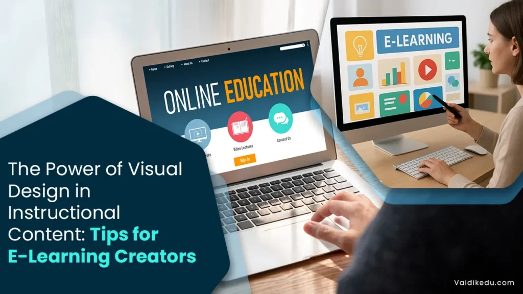
For the virtual world, the ever-growing demand for quality e-learning material has necessitated a greater emphasis on visual design. Competition to engage viewers is increasing and attention spans are shrinking-it is little wonder that good visual design underlies effective instructional content.
In reality, proper visual design helps to comprehend material retention better and hence improve instruction outcomes. Understanding visual design principles is essential for e-content developers in creating impactful and engaging instructional materials.
This blog explores why visual design in instructional content is important, provides actionable tips for developers, and shows how effective visuals can change learning experiences.
Why Visual Design Matters For Instructional Content?
Visual design is more than making the material look pretty. It has a critical place in how learners perceive and process information. Here is why visual design matters:
- Improves Comprehension: Complex information is broken down through simple images, which the learner can understand better.
- Increases Retention: As per research, visuals increase retention because learners remember pictures and visual cues better than text.
- Keep Learners Engaged: Beautiful and interactive visual elements capture attention and keep learners motivated throughout the course.
- Supports Accessibility: Well-designed graphics meet the requirements of different kinds of learners including people with disabilities because of features like color contrast, and alternative text.
Key Principles of Visual Design For Instructional Content
- Clarity And Simplicity
Simplicity is the basis of good visual design. Too much information can be overwhelming to learners. Use clean layouts, concise text, and simple visuals to keep the focus on the learning objectives. For instance, a chart with minimal labels and colors can be more effective than a cluttered infographic.
- Consistency
By applying the same fonts, colors, and visual styles at every step in an instructional material design, the coherence can be presented consistently to its readers. Because of this kind of consistent familiarity, content becomes a main object of consideration more than trying their senses at sense changes.
- Alignment with learning goals
Every visual component must have a purpose and tie to the learning objectives. Any images or graphics included should not be there simply for decoration since they will be a distraction from the message. For instance, if the objective is to explain a scientific concept, diagrams or animations can be used to show the process.
- Color Psychology
Color evokes emotion and may be used to change the processing of information that a learner accepts. Use color to draw focus to critical content, evoke a feeling, or for organizational purposes. Warm colors: red, and orange are attention-drawing colors whereas cool colors; blue, and green are calm. Clear contrast between the text and background makes reading clearer.
- Typography
Both reading and aesthetics are affected by typography. Be clear on your fonts and proper font size, depending on your device. At best, stick to two or three styles and avoid complex ones for instructions. A typographic hierarchy that includes bold for headings and standard for body text makes a huge difference in structuring the content properly.
- White Space
White space, or negative space, is the empty area between design elements. It makes the content readable and clean-looking, giving it a professional look. White space also allows learners to focus on key elements without feeling overwhelmed.
- Interactive And Multimedia Elements
Using quizzing, drag-and-drop exercises, or interactive diagrams wherein users can click keeps the learner engaged. Video, animation, and audio add a new dimension to learning owing to differing styles of learning. Too much use, however, would be the distraction might exceed the effectiveness due to multimedia.
Tips for E-Content Developers
1. Begin with a Design Plan
Plan a visual design before developing the content. Determine what the key takeaways are for the content, who your target audience is, and what type of visuals will support the learning objectives.
2. Accessibility
Your visual content must be accessible to all learners. Ensure high-contrast color schemes, use descriptive alt text on images, and provide captions on videos. WCAG tools will ensure compliance with accessibility standards.
3. Visual Hierarchy
Guide the learner through the content by establishing a clear visual hierarchy. Use headings, subheadings, and bullet points to organize information. Highlight important points using bold or contrasting colors to draw attention.
4. Multiple Devices
E-content is accessed on various devices, including smartphones, tablets, and desktops. Design visuals that are responsive and scalable to ensure a seamless experience across platforms.
5. Feedback
Get ongoing feedback from learners and instructors about your visual design. Track learner engagement through analytics and base development decisions on improvement areas.
6. Do Not Overburden the Senses
Too many graphics confuse the learner. Keep it to only what is most necessary and use visuals judiciously to illustrate key points.
7. Test and Revise
Test your content on a sample audience before finalizing it. Use their feedback to make adjustments that will improve clarity and effectiveness.
Tools For Effective Visual Design
E-content developers can use the following tools to create compelling visuals:
- Canva: Design infographics, presentations, and social media content.
- Adobe Creative Suite: A professional toolkit for creating and editing images, videos, and animations.
- Piktochart: A user-friendly tool for creating data visualizations and reports.
- Loom: A video recording application that also allows for screen sharing.
- Articulate Storyline: A professional tool to create interactive e-learning content.
Common Mistakes to Avoid
- Over-Complicating the Design: Simple is beautiful
- Forgetting Accessibility: Omitting accessibility will leave a segment of your audience behind
- Missed Inconsistencies: Lack of consistency can give an unprofessional look to your content
- Poor Graphics: Low-resolution images will give an impression that your content is not reliable
Tips For E-Content Developers To Leverage Visual Design
1. Clear visual hierarchy
Organize your content with a clear visual hierarchy that leads the learners through the material.
This can be accomplished by:
Headings and subheadings to separate sections
Using size, contrast, and color to focus attention on important points
Structuring information so that the learner knows where to go, intuitively, from the most critical to the least critical points
2. Make conscious color choices
Colors elicit emotions and determine how learners perceive content. Consider the following:
Use complementary color schemes to maintain balance and avoid visual clutter.
Apply consistent colors to maintain uniformity throughout the course.
Leverage color psychology-for example, blue for trust and calmness, and green for growth and positivity.
3. Use Visual Elements Wisely
Visual elements such as images, icons, and videos should complement the content rather than distract from it. Remember:
Use high-quality visuals that are relevant to the topic.
Avoid overloading the screen with too many elements.
Make sure images have alternative text, and include captions for video accompaniment.
4. Typography
Typography is an extremely big influencer on the readability and interest factor. For text to look appealing:
Use clear serif-free fonts like Arial or Open Sans.
There must be space between lines and paragraphs to read clearly.
Use no more than two to three styles to minimize distraction.
5. Using White Space
White space, or negative space, prevents content from feeling cluttered. It serves to:
Focus attention on important elements.
Enhance readability and concentration.
Create a clean, professional appearance that encourages engagement.
6. Interactive Visuals
Interactive elements like clickable diagrams, drag-and-drop activities, and animations encourage active learning. These tools make the learning process more engaging and allow learners to interact with the content.
7. Align Visuals with Learning Objectives
All graphics and layouts should be meaningful. Graphics and layouts should be related to the learning objectives to emphasize key concepts. For instance:
Use flowcharts to explain processes.
Include timelines for historical content.
Add graphs to present data-driven insights.
8. Access Check:
Instructional content can be accessed by all learners, including learners with disabilities, using accessible design. Consider the following:
Color contrasts for students with visual impairments.
Incorporate captions or transcripts in all multimedia.
Craft material that is screen-reader-friendly.
9. Leverage Consistency
One of the most important reasons is that it brings consistency in design, which makes information look familiar and decreases the cognitive load incurred. Ensure the same layout, color scheme, and navigation system throughout the course. Learners may be not distracted by perpetual changes in visuals and can focus on the course content.
10. Data Visualization
Data-rich content can be overwhelming to the learner unless properly represented. Represent data in visual forms such as:
Charts and graphs for numeric data.
Heat maps for geospatial or spatial data.
Infographics: to present the masses of information.
Conclusion
Effective instructional content and engaging access to resources make learning easier. For e-content developers, understanding visual design principles is essential for producing meaningful educational materials.
The areas of clarity, accessibility, and relevance can be tailored and transformed to make e-learning a dynamic and immersive process. Technology will only continue to play a more significant role, and that is why visual design plays a big role in shaping the future of learning.
Frequently Asked Questions
Visual design makes the information clearer and more appealing to the reader’s eye and hence enhances understanding, engagement, and retention for various learning styles.
Some of the popular tools used are Canva, Adobe Illustrator, Figma, Piktochart, and PowerPoint for professional and engaging visuals.
Visuals are incorporated with alt text, captions, and high-contrast designs to be more accessible for learners with disabilities.